Frequency Distributions and Statistical Graphs
- A frequency distribution is a listing of the observed values and corresponding frequencies of each value.
- You are good at simple, single data point frequency distributions.
- The number of children per family is recorded for 64 families surveyed. Construct a frequency distribution of the following data:
    0  1  1  2  2  3  4  5
    0  1  1  2  2  3  4  5
    0  1  1  2  2  3  4  6
    0  1  2  2  2  3  4  6
    0  1  2  2  3  3  4  7
    0  1  2  2  3  3  4  8
    0  1  2  2  3  3  5  8
    0  1  2  2  3  3  5  9
- Each frequency class will contain a single value.
| Number of Children | Number of Families |
|---|
| 0 | 8 |
| 1 | 11 |
| 2 | 17 |
| 3 | 12 |
| 4 | 6 |
| 5 | 4 |
| 6 | 2 |
| 7 | 1 |
| 8 | 2 |
| 9 | 1 |
- Here the classes are 0, 1, ... 0
- Each class contains exactly one element
- And the class width is one.
- You are very good at this as you have been doing this for a long time.
- But you need to be able to construct one with larger classes.
- The class width is the number of elements that fit into each class.
- The lower class limits are the first element in each class
- The upper class limits are the last element in each class.
- The class mark is found by (lower class limit+upper class limit)/2
- When constructing a frequency distribution
- The classes should be the same width
- The classes should not overlap
- The classes should cover all of the data.
- The ages of the 44 us presidents at their first inauguration was
        57    57    49   52   50  42   54   55   64
	61    61    64   56   47  51   51   56   46
	57    54    50   46   55  56   60   61   54
	57    68    48   54   55  55   62   52   47
	58    51    65   49   54  51   43   69
- Construct a frequency distribution with a first class of 42-47
The class width is 47-42+1 = 6
The first class starts at 42, the next starts at 42+6 = 48, next at 48+6 = 54
The first class ends at 47, the next at 47+6 53,

We need to go until we include the largest value (69)
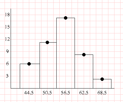
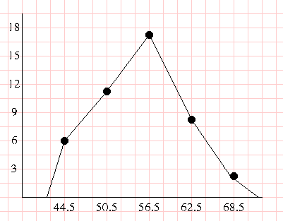
   Age         Frequency
42 to 47           6
48 to 53          11
54 to 59          17
60 to 65           8
66 to 71           2
- Histograms and Frequency Polygons
- These are both ways to display frequency distributions
- Histogram is a column chart.
- Label the x axis with the class mark for each class
- Label the y axis with the frequencies
- Draw polygons centered on the class mark.
-

Frequency polygons are line graphs.
- Same as histogram but connect the points with lines.
- Anchor to the x axis on both ends.
-

Stem and leaf
   5|9 represents 59
Stem   Leaves
   4|927668793
   5|7720456116740564745528141
   6|4114018259
Circle Graphs

