Charts (Part I?)
- We will be working with this data.
- Housing sales in 2014/5 in Kings County Washington State.
- From Kaggle.
- Setup
- Delete the ID column.
- Please add three columns after A and turn the date field into Year, Month, Day
- Do this with text formulas just to remind yourself how.
-

-

- Select the entire table and use the name manager to name the columns.
- In data science there are frequently two stages of making charts
- Exploratory analysis
- Presentation.
- You find MANY documents that discuss the difference.
- Don't feed people a bunch of charts from data analysis.
- These are your work, to figure out what is happening in the data.
- These don't need to be completely documented.
- But they do need to be accurate.
- For presentations
- The rules for presentation graphs
- Everything is labeled
- Title
- Axis
- Data
- Correctly labeling your data helps
- Add titles and axis labels and everything else.
- This is a matter of discipline.
- It is way too easy to just slap up a chart and consider it done.
- Make sure it is right
- And don't change scales or other items to make it "better"
- Don't go wild with chart types
- Use charts people understand.
- Avoid 3D
- Make simple charts/graphs.
- Eliminate clutter.
- Some of what we will do in the next classes will contradict this.
- For exploration we will probably not label everything.
- We will probably overdo charts as well.
- We want to learn as many pieces as we can.
- But just because you know them doesn't mean you need to use them.
- Let's try a graph.
- My intuition tells me that the size of the house is related to it's price.
- So let's build a scatter plot to see if that is true.
- Insert a new worksheet
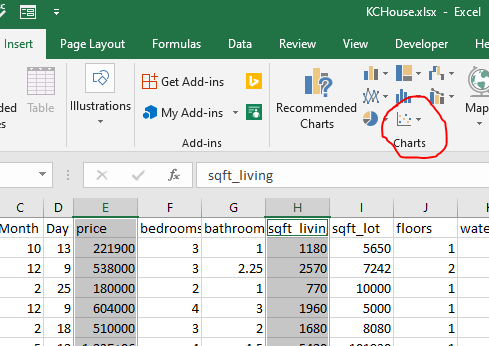
- Select the Price column (E) and the sqft_living(H)
- On the insert tab, select the scatter plot chart
-

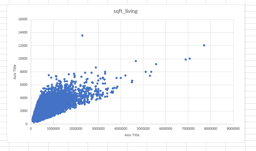
- I cut and pasted this to the new worksheet.
-

- What is a scatter plot?
- For each pair (price, sq_ft) it plots a point.
- It does this for all of the data.
- So what do we see in this scatter plot?
- There is a correlation between these two values.
- Correlation does not imply causation.
- And it is perhaps not quite as strong as we would like
- Let's try an experiment.
- Grab a new worksheet
- In column A generate the numbers 1 = 200 (just to keep track) in a column
- In columns B and C generate 200 random numbers with (randbetween(1,1000)) in the next two columns.
- Copy these to columns E-G, paste as values
- Generate a scatter plot from columns F and G
- Let's try something silly.
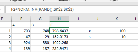
- norm.inv will give us an inverse normal function.
- We can use this to generate normally distributed data.
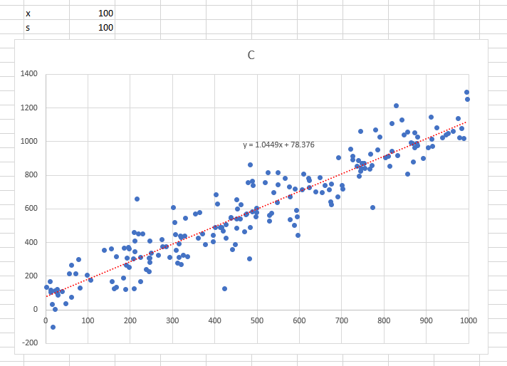
- In J2 put x, K2 100
- In J3 put s, K3 10
- In H2 put =F2+norm.inv(rand(),$K$2,$K$#)
-

- plot this (columns F and H)
- Change s to be 50
- Change s to be 1000
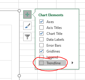
- Sometimes it is helpful in a scatter plot to see a trendline
- Click on the chart, the + sign and select trendline
-

- Click on the arrow and select more options
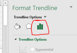
- If you are not on the Trendline Options, select these.
-

- Select liner
- Also select show trendline.
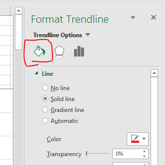
- Move to the line section
-

- Select red (so we can see the line)
-

- Adjusting elements of a graph.
- Between the + tool clicking on elements.
- This is a learn by exploring thing.
- Back to the SQFT_Living
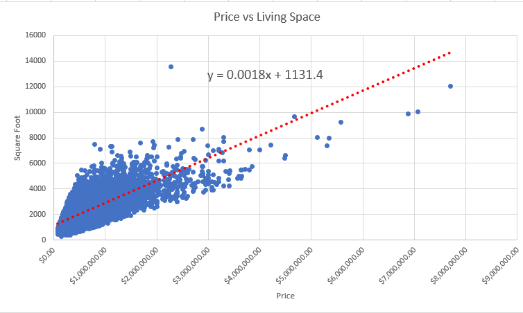
- Change the title to Price vs Living Space
- Add an x and y axis label for Price and Square Foot
- Format the x axis as currency
- Rotate the labels by -45 degrees.
- Add a trend line.
-

- Note charts are tied to the data.
- Go back to the data and turn that into a table.
- Filter price for values less than $1,000,000
- Filter price for values less than $200,000
- Notice that the scatter plot changes as well.
- Plot the square foot of the lot vs the price.
- Does this tell you anything?
- If there is time,
- Can you find the average price of a house based on the condition?
- How would you display this?


