The Analysis Toolpak
- I was browsing the book and came across chapter 33, Analyzing Data with the Analysis Toolpak
- You all probably have had more statistics than I.
- But let's look this over.
- Please use This Workbook
- Enabling the toolpak
- Go to the Data tab.
- Is Data Analysis displayed in the Analysis command group?
-

- If it is not enabled, here is the process
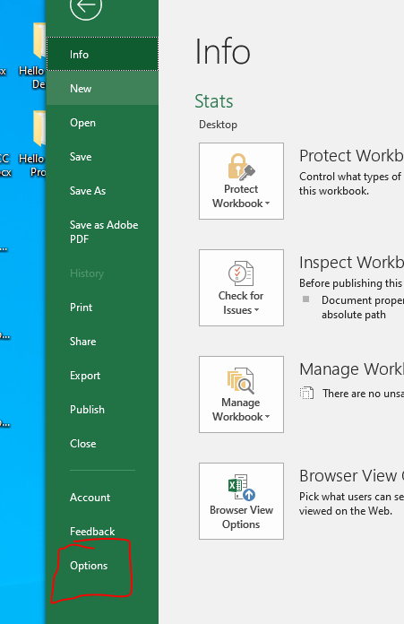
- File -> Options
-

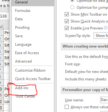
- Select Add-ins
-

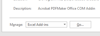
- Select Manage Excel Add-ins and go.
-

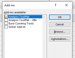
- Select the check box next to the Analysis ToolPak and Ok
-

- I had this enabled, but it was not showing up.
- I completely disabled it
- Then went back and enabled it.
- And the toolpak showed up.
- Check it out.
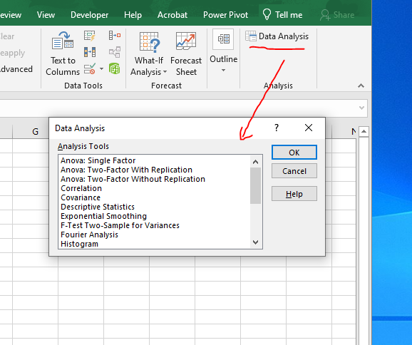
- Click on Data Analysis in the Analysis command group of the Data tab.
-

- Scroll through here look at the different tools.
- As I said, I don't know stats,
- But I happen to have a stats book at home.
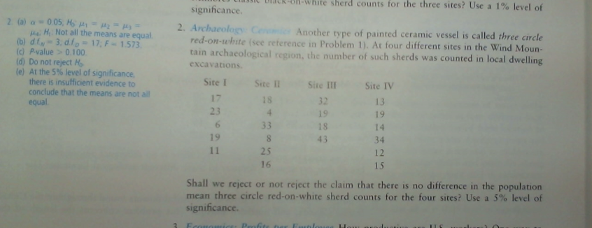
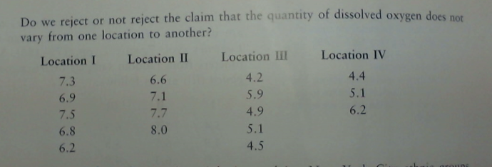
- From the ANOVA chapter, I typed in a few data sets.
-

- Let's do this exercise.
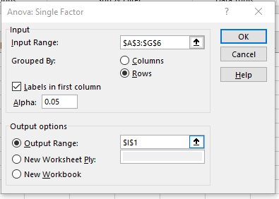
- Select Single Factor Anova
- The Input Range is A3:G6
- It is grouped by Rows
- With labels in the first column.
- The question asks for a 5% level of significance.
- Let's put the results starting in I1
-

- By the way, the book answer is
-

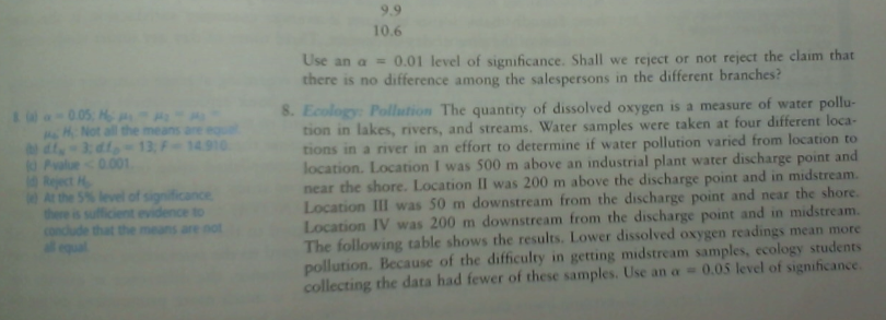
- Let's do exercise 8
-

-

- Still single factor anova.
- The analysis toolpak is annoying in that it keeps old settings, so be careful.
- The data is in columns, with labels in the firs row.
-

- Apparently there are two different ANOVA types for multiple variables.
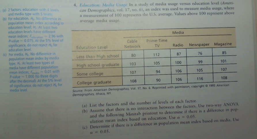
- Question 4, Page 740 is a Two Way without replication
-

-

- Looks like things are already set up, but if not
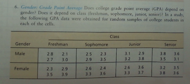
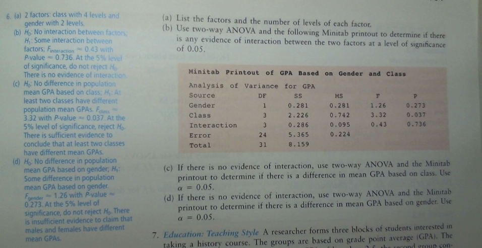
- Finally a two way ANOVA where the data is not summarized. (With Replication)
- Question 6 Pge 750
-

-

- I'd like to do some basic statistics, but I forgot to add in the dataset.
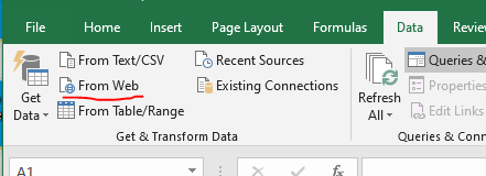
- On the Data tab in the Get & Transform Data command group, click on From Web

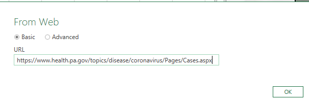
- Use the url https://www.health.pa.gov/topics/disease/coronavirus/Pages/Cases.aspx
-

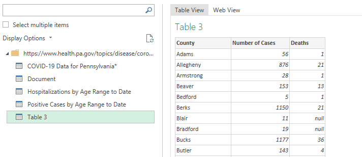
- We want the only table they did not label, Table 3.
- So click on that and load it.
-

- Let's try Descriptive Statistics from the Analysis Toolpac
- It doesn't like the labels.
- Let's try A correlation between Cases and Deaths.
- It appears to have a r value of .97
- We could compute that by hand with =correl()
- Draw a scatterplot just to be sure.
- Let's try a histogram.
- It only wants one column.
- Remove the values in the bins area.
-

- Not very satisfying, so let's try building our own bins.
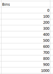
- Build this table.
-

- Make sure you get the label at the top.
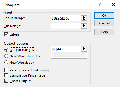
- Then specify this, including the label as the "bins" value.
- Let's try rank and percentile with this data.
- I like random numbers.
- Let's play with the normal curve.
- The IQ test is defined to have a mean of 100 and a standard deviation of 15.
- Let's generate some fake IQ scores.
- Grab a new workbook.
- Select Random Number Generation
- Select normal
- The number of variables is the number of columns
- The number of random numbers is the number of rows.
- Looks like it is set up for 100, but let's go to 10000
- Set mean and standard deviation if they are not set.
- I suppose we should do a little analysis.
- Do the descriptive Statistics.
- Build a set of bins 55, 70, 85, 100, 115, 130, 145 and build a histogram.
- Build a histogram.
- Add a column next to it and place the Moving Average of the last 10 items.
- Graph the first 50 of these.

