Creating Better Charts
- This is mostly based on Cole Knaflic's Storytelling with Data
- From the forward
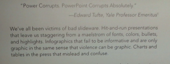
- "Power Corrupts, PowerPoint Corrupts Absolutely" - Edward Tufte
- "We've all been victims of bad slideware. Hit-and-run presentations that leave us staggering from a maelstrom of fonts, colors, bullets, and highlights. Infographics that fail to be informative and are only graphic in the same sense that violence can be graphic. Charts and tables in the press that mislead and confuse."
-

- She discusses storytelling with data
- We learn to do math in school.
- We learn to use language in school.
- But we rarely have the two together.
- She believes that "Being able to visualize and tell stories with (data) is key to turning (data) into information that can be used to drive better decision making."
- On Office
- "... anyone can put some data into a graphing application and create a graph."
- She says that being "adept" with office was once a thing that set applicants apart
- "... without a clear path to follow, our best intentions and efforts (combined with oft-questionable tool defaults) can lead us in some really bad directions: 3D, meaningless color, pie charts."
- She is not a fan of pie charts.
- Without care, graphs from excel
- Fail to emphasize the point
- Or completely overwhelm the viewer
- An example
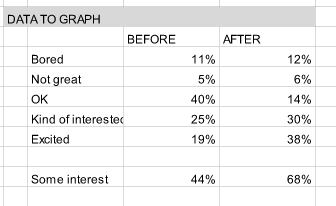
- The results of a survey before and after a program introducing second and third graders to science.
- The data "How do you feel about doing science?"
-

- Do you see a "story" in the data?
- Grab this worksheet
- The first pass at visualization.
- In B10 put "Interested or Excited"
- Calculate the sum of c7:C8 and D7:D9 ind C10 and D10
- Let's also compute "Not Great or Bored"
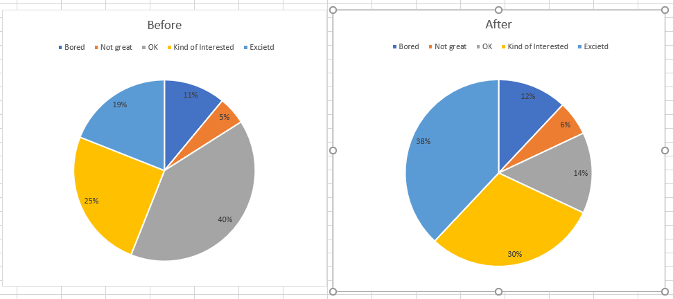
- Draw a pie chart for each column.
- Use layout 2 of the quick layouts.
-

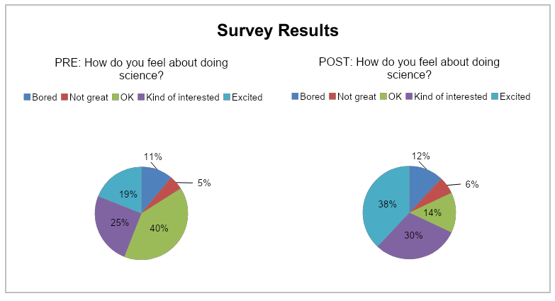
- Her example from the book.
-

- Does this chart tell the story?
- Well yes sort of.
- Side by side comparison of pie charts is difficult.
- Her critique is that the reader has to work too hard to get the message.
- She makes several suggestions
- Skip the graph.
- Look at the graph on the FromKnaflick worksheet.
- How did she do this?
- A simple bar graph
- Let's start by drawing a bar graph.
- Find a quick layout that is close
- Note she
- Changed the colors.
- She got rid of the orange.
- She also
- Ditched the legend, but used colors in supporting text to indicate the classification
- Ditched the axis.
- Has the data available, but de-emphasized through the use of lighter font.
- 100% stacked horizontal bar graph.
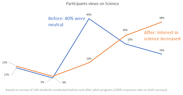
- slopegraph
- This is just a line graph.
- I also like a simple line graph.
-

- She has six basic principles
- Understand the context.
- Who is your audience and what do you want to tell them?
- Choose an appropriate visual display
- What is the best way to show what you want to communicate.
- As we saw above, perhaps just a number or text.
- Eliminate clutter
- Every single thing on the screen adds to the cogitative load of your audience
- Identify those things taking up brain power that do not contribute to the point.
- And eliminate them.
- Focus attention where you want it.
- She spends quite a bit of time focusing on color.
- Think like a designer
- Tell the story
- She really encourages sparse presentations
- In a presentation, you are there to fill in details.
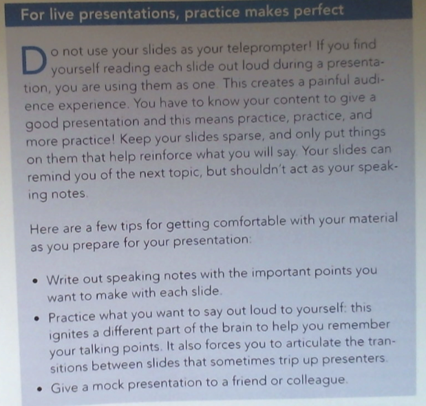
- Read the box
-

- She points out that both presentations and written documents covey information
- But in different ways.
- And a single document is probably not sufficient or efficient at both.
- Too much detail in a slide and you lose your audience.
- Too little detail in a document and people don't understand.
- Very quick review of visual display types
- Text only
- Tables
- She says that you should rarely or never use tables in a presentation.
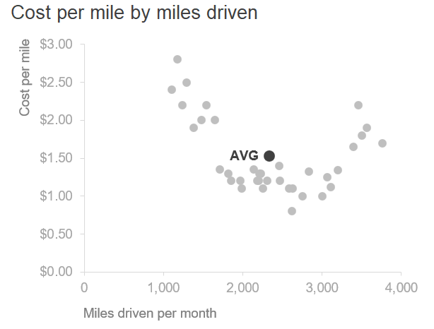
- Scatterplots
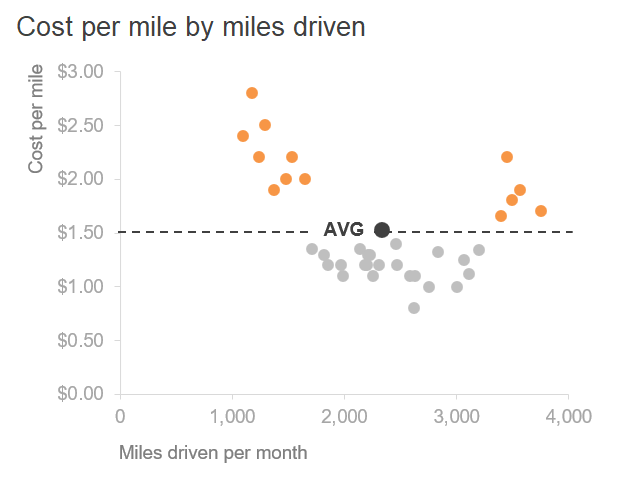
- An example of how coloring can help
-


- She says probably best for scientific audiences.
- Lines
- Probably best for continuous data.
- The line implies a connection.
- Slopegraphs
- Good for showing difference is multiple categories over two times
- Able to present a lot of information in a compact form.
- She provides a link to a template she uses for building these.
- Bar charts
- She says people avoid these because they are common.
- But she encourages you to use them for that reason.
- Both vertical and horizontal (column charts)
