Basic Pivot Tables
- Today we will use a cleaned version of the superheros dataset.
- This information is from page 492 in your text.
- A pivot table allows you to quickly produce summary information about one or more fields of your data.
- You need to use caution when employing a pivot table
- It is extremely easy to produce meaningless results.
- Pivot tables need
- Rows of columns (like we have been using)
- Column headings.
- At least one column with repeated data to summarize.
- Pivot tables can allow you to combine multiple tables of data.
- We will probably not use this feature this semester.
- But be aware, they are capable of more than we will discuss.
- Creating a pivot table.
- Click anywhere inside of the dataset for which you wish to create the pivot table.
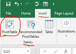
- On the Insert tab in the Tables command group select Pivot Table.
-

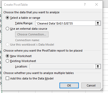
- This will bring up the Create PivotTable dialog.
-

- You really don't need to change any of these settings for a simple pivot table.
- I find that pivot tables are great means for exploring data.
- I will delay labeling the worksheet until I know I have something I want to save.
- I will create and destroy pivot tables frequently.
- We can use pivot tables to count data.
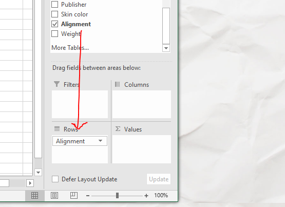
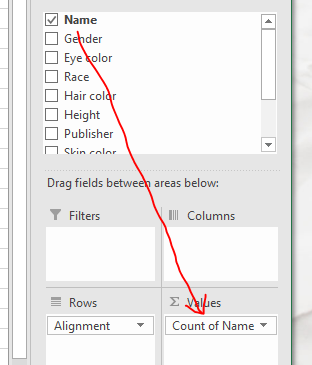
- Drag Alignment into the Rows area.
-

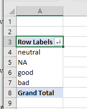
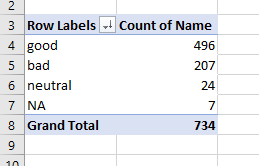
- Notice that this produces a unique list of alignments.
-

- Drag Name into the Values area
-

- Notice that now the number of each gender is counted
-

- I sorted mine
- What happened?
- Excel decided that the only thing to do was to count the names
- So it applied a countif on the name field.
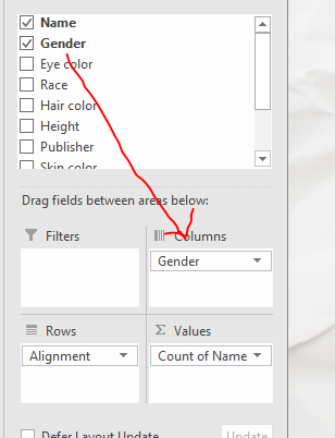
- I am interested in alignment vs gender
- So grab Gender and drag it down to the Columns
-

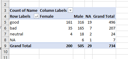
- Notice this produced a Table of values.
-

- Comparing numbers is really not the right way to do it.
- We really should compare percentages.
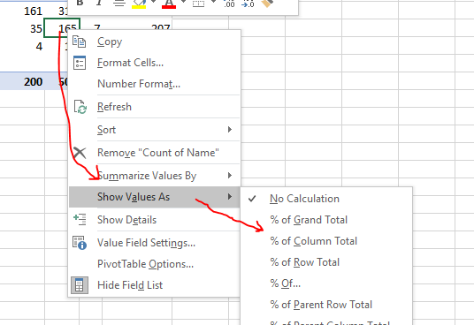
- Right click in any of the numeric fields.
- Select Show Values As
- Select % of Column Total
-

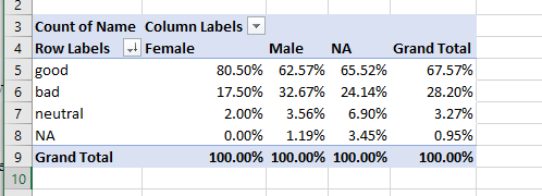
- We can now compare the genders more easily.
-

- What would we be comparing if we looked at the % of row total?
- I'm not happy with the two decimals.
- So change the formatting to one decimal place.
- Do you notice anything?
- I wonder if hair color has an impact
- For example, I would like to look at the beautiful bald people.
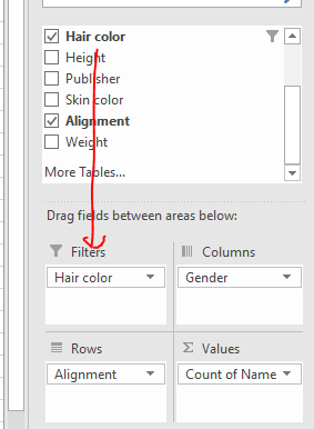
- Drag Hair Color down to the Filters area
-

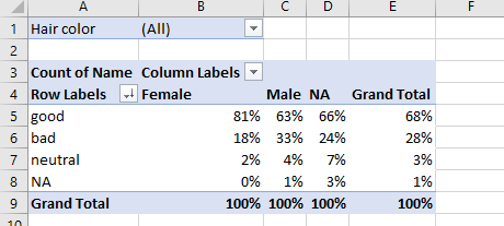
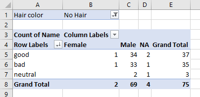
- Notice a filter now appears above the data.
-

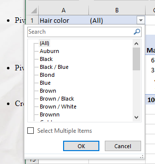
- Drop down the filter
-

- Click the box next to Select Multiple Items
- Then find and select No Hair
- These percentages look strange, let's go back to numbers.
-

- The numbers are small, but we might have a new item to investigate
- Bald people are equally distributed between good and evil.
- Let's forget the gender and just compare hair color to alignment
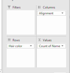
- Drag Hair color from Filters to Rows
- Drag Alignment from Rows to columns
- Remove Gender from the columns box.
-

- I'd like to sort this
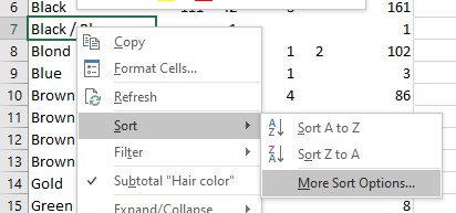
- Right click on any hair color.
- Select Sort
- Select More Options
-

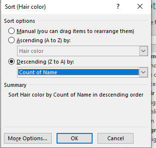
- Select Descending, and choose Count of Name
-

- Everything below Red hair probably has too few instances to draw any conclusions.
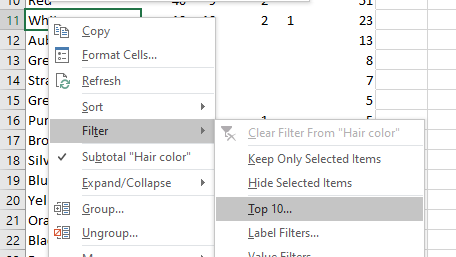
- Right click on any hair color
- Select Filter then select Top 10
-

- Change the 10 to be a 6.
-

- Again, switch back to percentages, but this time by row.
- Can we draw any conclusions?
