Exploring Grades
- We will be exploring charts.
- This starts on page 421 of your book.
- Charts are what the rest of the world calls graphs.
- This is the Gradebook for a random class.
- Notice
- They have had a number of homework assignments, worth 35% of their grade.
- They have had a test, worth 30% of their grade.
- They have worked on a project, worth 35% of their grade.
- Statistics for the homework are computed below each homework.
- What do you notice about this?
- Why does the standard deviation change in this.
- Notice a lookup table, and a count if for the grades at the bottom of the sheet.
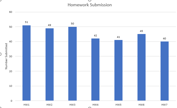
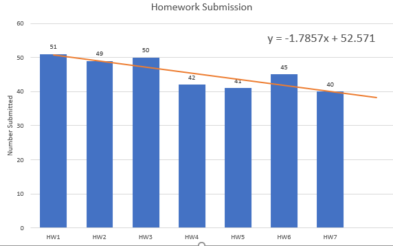
- Let's look at homework submission rates.
- Select B1:H1 and B57:H57, use the control key to do so.
- Select the Column or Bar chart dropdown from the Charts command group on the Insert
-

- Select Clustered Column
- Knaflic says "Sometimes bar charts are avoided because they are common. This is a mistake. Rater, bar charts should be leveraged because they are common, as this means less of a learning curve for your audience"
- Notice by selecting the column headings, the graph is labeled.
- Make sure that you add a title.
- And at least an vertical axis title.
-

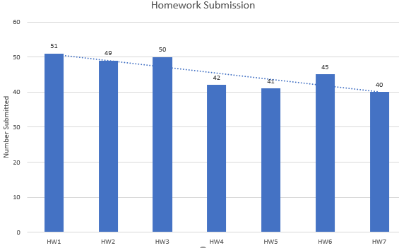
- Add a Trendline
- As you progress in stats or data science you will learn about these.
- In general a mathematical model is used to show a "trend" in the data.
- This can be extended to "predict" future behavior.
-

- We can't explore everything, but let's play with trend lines a bit.
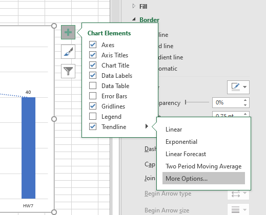
- Click on the + sign, hover over Trend Line and click on More Trend Line Options
-

- Under the Paint Bucket Fill & Line change the line to be wide, no dashes and orange.
- Go to the Trendline Options (The graph looking icon)
- Notice we can change the mathematical function that we use to build the model.
- This is a discussion you will have in machine learning.
- Changing to Polynomial degree 6 will Overfit the curve. (IE Match the data exactly, not really a good thing)
- Change back to linear.
- Notice you can add a forward prediction.
- You can even display the linear equation if you wish.
- This will mean more after you have had some more stats.
-

- We can click anywhere and that will make that portion of the chart's configuration menu active.
- Click on the vertical axis numbers.
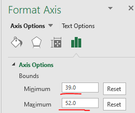
- That should bring up the Format Axis menu
-

- We could adjust the ranges of the axis to emphasize that fewer people are doing homework.
-

- Boy that really gets the message across!.
- Knaflic states "But what if changing the scale on a bar chart or otherwise manipulating the data better reinforces the point you want to make? Misleading in this manner by inaccurately visualizing data is not OI. Beyond ethical concerns, it is risky territory. All it takes is one discerning audience member to notice the issue ... and your entire argument will be thrown out the window, along with your credibility."
- Reset the axis please.
- Knaflic probably doesn't like the width of the bars either.
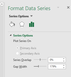
- Double click on a bar to bring up the Series Options
-

- Knaflic would like bars to be wider than white space.
- But not so wide that the audience thinks area is important.
- So drag the Gap Width to be about 75%
-

- Let's look at the labels above the boxes.
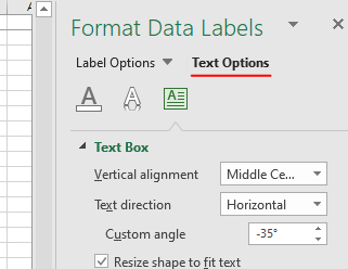
- Double click to bring up the Format Data Label menu
- You can change the font size on the home tab.
- Note there are two different sub menus.
-

- With text options you can change the angle of the labels.
-

- Notice under the Label Options you can set the items that are in the label.
- When you want to show multiple related data items a cluster column or bar chart will do well.
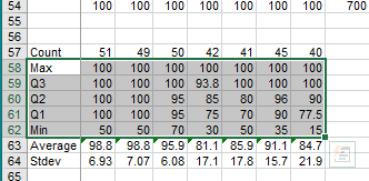
- Highlight A58:H62
-

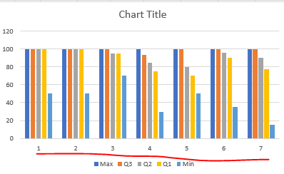
- Select Clustered Column chart again.
-

- Notice the numbers across the bottom.
- This is because we didn't provide column headers.
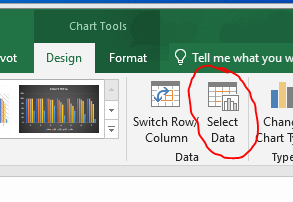
- On the Chart Tools menu, select Select Data
-

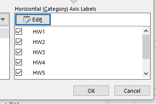
- Edit the Series and select B1:H1
-

- Notice that this gives us the proper labels at the bottom.
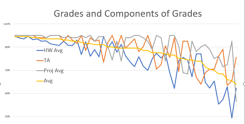
- A line graph is good for showing change over time.
- But I want to look at how grades are related to homework, tests and project.
- Sort column W high to low.
- Select the data in columns J, N, T, W
- Ctrl Shift Down, Ctrl - Click, CTRL -shift Down , ....
- Draw this as a line chart.
- Delete the labels at the bottom, they are meaningless.
- I changed the location of the legend.
-
