A Second Project: Basic Data Analysis
- In any project, the next step is basic data analysis.
- We need have five fields, so we need to analize these fields.
- This is just the work we have done before.
- For numeric data
- Five number summary
- Possibly box and whisker plot
- Frequency distribution and histogram
- Count or identify bad data.
- For text data
- Identify unique words
- Frequency
- Perhaps rank
- List of most common
- I understand that this is a repeat of what we have done before but you need to do it to identify problems with the data.
- In addition, this work will help you find problems in the data and indentify where it needs to be "cleaned"
- I will build a new tab for each field.
- Since this is a small data set, I will copy the data to the new tab.
- This will allow me change the Sorted Data sheet without interfering with the other tabs.
- If the data were large, I would not do this.
- Homework
- Make a new tab for homework.
- Copy the homework data to that tab.
- Sort this new columnm
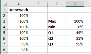
- Build a five number summary
- I use quartile.exe because that matches the box and whisker plots.
-

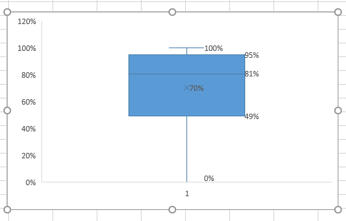
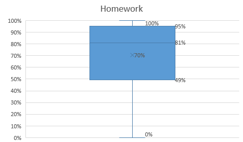
- Build a box and whisker plot
- Use the data in column A, not the computed summary data.
- Select Layout 2
-

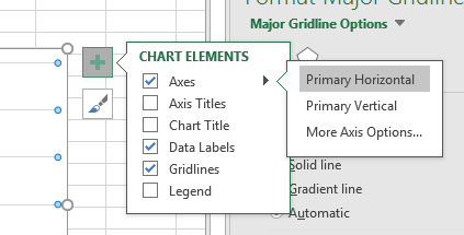
- The 1 at the bottom is annoying, and useless.
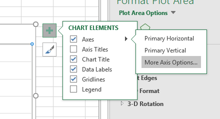
- Turn it off by selecting
- Axes, Primary Horizontal
-

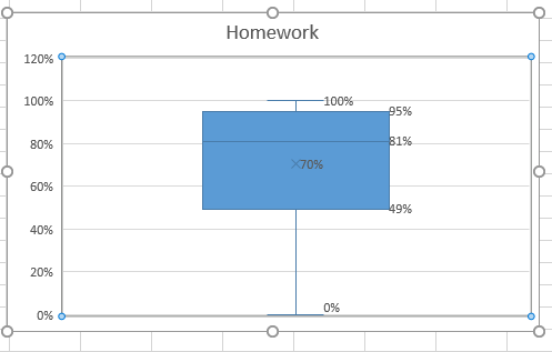
- Add a title as well.
-

- I find the 120% at the top distracting as well.
- Select More Axis Options
-

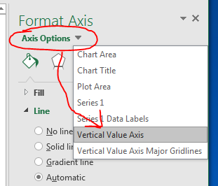
- Using the Axis Options menu , select Vertical Value Axis
-

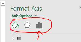
- You have three choices at the top
- Fill & Line
- Effects
- Axis Options
-

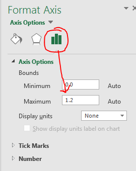
- Select Axis Options
- And change the Maximum to 1.0
-

-

- We need to make sure we pay attention to the graphs we create.
- What does this graph tell us?
- Half of the homework grades are above an 81.
- The average homework grade was a 70.
- The top 75% of the class has lots of near 100% scores
- The bottom 25% is very spread out.
- We can verify this by looking at the data.
- But in a very large dataset this might not be possible.
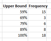
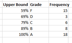
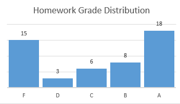
- While we are here, build a frequency distribution.
- By grades, so start at 59% (grades 0 - 59)
- Go up by 10%
-

- Add in a column for Grade.
-
-

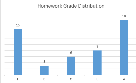
- Produce a column chart based on grade and frequency
-

- By the way, the width of the columns can be adjusted with series Options
-

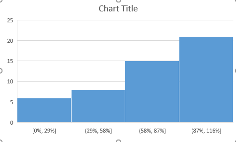
- We can insert a histogram of this data as well
- Select column A
- Insert a histogram
-
-

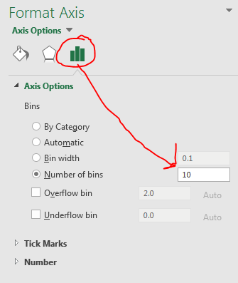
- Change the number of bins
- More axis format
- Axis options
- Change number of bins.
-

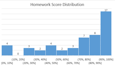
- Fix the title, lables and vertical axis
-

- Why are the two counts off?
- We should probably count the number of valid data as well.
- I just tacked this on top of the 5-number summary.
- Do we think there are any errors in the data?
- Do we think that the data needs cleaned in any way?
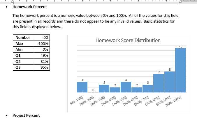
- Now that we have a basic analysis of the homework field, we should go to the report and add the information.
- In the data dictionary, I would add
- A description of the data
- In the Summary of data used section I would include
- The five number summary.
- The histgram.
-

- I would save the other graphs.
- They could go into the Summary section.
- You might use them in answering the question.
- We really did not do any data cleaning, so there is noting to note here.
- We really did not do any advanced computations, so there is nothing to note in the Analysis Methods section.
