Some Graphs
- Before we start, we should make a decision about
- The empty cells
- The cells with 0 in them.
- Why?
- Excel deals with blank cells differently from cells with 0 from cells with text.
- Talking to the data custodian, you have discovered that no scores of 0 were recorded.
- So the cells with 0 and the blank cells are the same thing.
- In this document.
- A peer reviewed journal article.
- Rule 1: Be Consistent
- Rule 4: No blank cells.
- You should already appreciate the importance of consistency.
- We have worked towards it by fixing text fields.
- No blank cells is open to discussion
- We saw that -99 caused a problem in the super hero dataset.
- A blank could be intentionally blank, or could be a marker for bad data.
- A blank is sometimes hard to spot.
- A blank will show up in reports as a blank, and be hard to read.
- The authors suggest NA or -
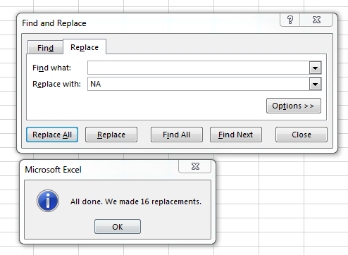
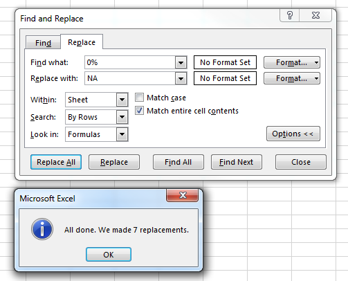
- Given this discussion, let's replace all scores of 0 or blank with a "NA".
- Use find and replace to do this.
- Note that 16 blank fields were replaced with NA
- Note that 7 values of 0% were replaced with NA
-

-

- We should enter a short paragraph into the methods document
- Describe how the decision was made
- IE that blank fields and 0% were equivalent
- Both represented no data present.
- We decided to change all to NA
- The number of each that were changed.
- Place a screen showing the action (IE the two screen shots above)
- Describe the results of this action
- Three students had submitted nothing in the class.
- We should talk to a domain expert, but these probably should not be counted in our analysis.
- So remove these three.
- And describe this process as well.
- We could further discuss the other students.
- Should the students who failed to take the test be included?
- Should the student who has taken the test but done nothing else be included?
- Since these are grades at midterm, I think it is reasonable to include these students.
- For all of this, you could chose another direction, but let's use this set of decisions.
- Once we are finished, we should update the data on the homework sheet.
- One technique for exploring the data is to build some charts of multiple fields.
- Box and whisker plots make more sense when looking at multiple related data fields.
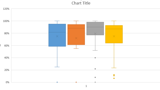
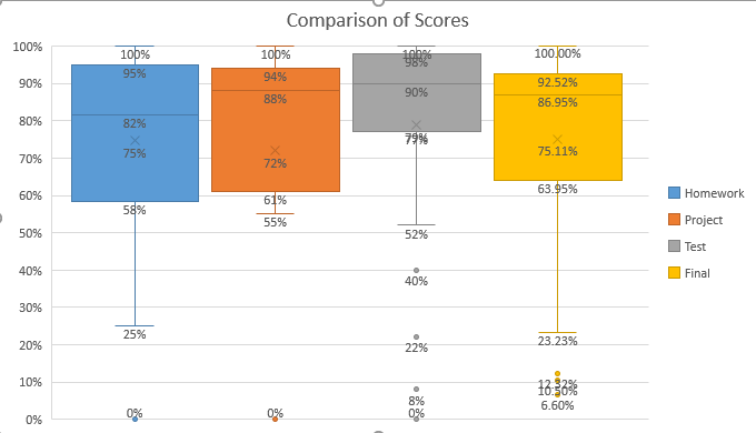
- Since all of our numeric fields are percents between 0 and 1, let's build a box and whisker plot of the entire dataset.
- Highlight columns A, B, C and D
- Insert a box and whisker plot
-

- This needs some work.
- Remove the horizontal axis
- Set the maximum value on the vertical axis to be 1.
- I like changing the gap width on Series Options to make the boxes fill the screen.
- Add Data Labels
- Finally add a legend
-

- Why are there no 0% outliers for the final score?
- Why is 40% an outlier for Tests, but not for the final?
- What does this graph tell us?
- It looks like, for the most part, people did better on the test.
- It has the highest Q3.
- Q2-Q3 is a very small range.
- It has the highest median.
- And nearly the highest mean.
- Let's do a quick count, on how many people in each category did better than a 60% (how?)
- It sure looks like the outliers are really killing the test.
- Let's try another graph
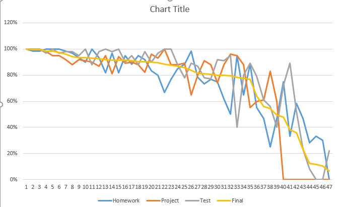
- Select A1:D48
- Go to the Insert tab and select Recommended Charts in the Charts workgroup.
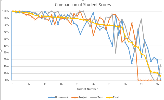
- Select the Line Chart.
-

- We need to clean this up a bit too
- Add a title (Comparison of Student Scores)
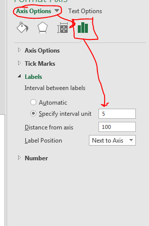
- Under Axis Options change the interval to be 5
-

- Add a horizontal title of "Student Number"
- Again change the vertical axis maximum to be 100%
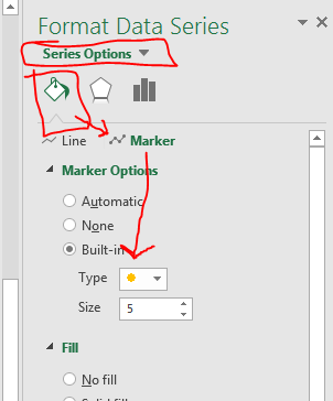
- Add markers to each of the lines
- Click on a line
- Use the Fill & Line menu
- Select Marker
- Then Built-in
-

-

- What does this graph tell us?
- One more graph to show a new technique.
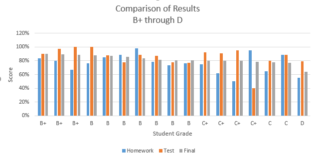
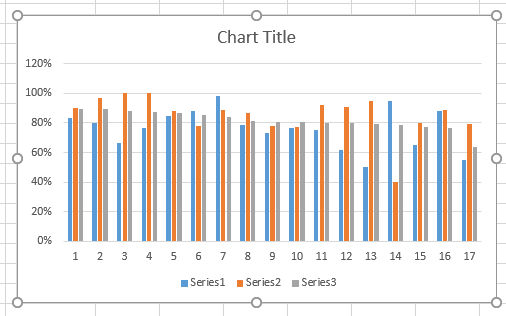
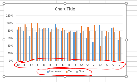
- I want to build a column chart displaying Homework, Test and Final for the grades between A and F.
- Freeze the top row so the headings are visible (View Freeze Panes)
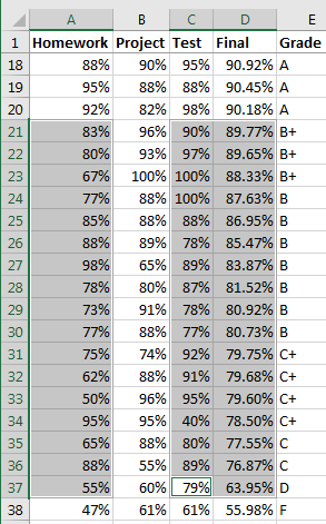
- Highlight A21:A37
- Hold the control key and highlight C21:D:37
-

- Draw a Column Chart
-

- We need to give the series names
- For contiguous data, this is not a problem.
- Here we need to insert it
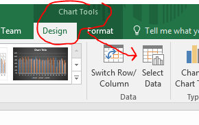
- On the Chart Tools Design tab in the Data workgroup, select Select Data
-

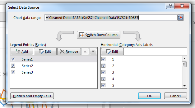
- This will pop up the Select Data Source window
-

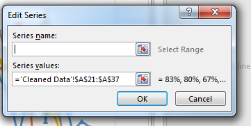
- Edit Series 1
- Set the name of the series to be "Homework", by clicking in cell A1
-

-

- Repeat this for series2 and series3
- You can do the same for the Horizontal Axis Labels
- Edit one and select the entire range.
-

- Add titles
-
