Posters
- But first
- Please send me a poster abstact and title by Nov 22. I will build a program over break.
- Please sign up via email for a presentation slot either 12/5 or 12/12
- As always first come first served.
- Many sources
- History: (From Gastel and Day)
- In the late 60's conferences began to become "overbooked" with papers.
- This lead to a high rejection rate.
- And good information was being lost.
- So the poster session was created.
- A Poster session
-
 (From Wikipedia)
- Usually a large hall or open area.
- Portable "walls" to hang the poster on.
- Presenters stand by their posters.
- Audience walks by, engaging poster presenters.
- There are frequently judges scoring the posters.
- But why do this?
- Allow you to interact in a more personal way with your audience.
- Allow a more informal way to present your findings that might not quite be ready for a formal presentation.
- Why attend?
- Many of the big conference offer coupons for drinks for attendees who go to the poster sessions.
- Often there is free food
- Sometimes prizes.
- Frequently conference recruit members to judge posters.
- The audience
- Presenters.
- Other conference attendees.
- Possibly outsiders as well (open hall, conference outreach, ...)
- What should happen
- You stand by your poster.
- People come up and interact with you.
- You should have a brief (5-10 minute) description of your work.
- Your audience should ask questions and or provide critique and feedback
- What should not happen
- Your poster is actually a large paper, and people stand there and read it.
-

- You stand there and don't interact.
- You act like a car naval barker and harass the audience.
- Gastel and Day
- follow Introduction, Methods, Results, Discussion
- They say a poster should have between 500 and 1000 words.
- probably arranged in a number of columns
- Short, attention grabbing title.
- 72 point font.
- Authors listed smaller, but at least 18 point font below.
- A succinct introduction
- Small paragraph, easy to read, state your problem.
- With these two elements, you want to invite people into your presentation space.
- "The poster should be self-explanatory, allowing different viewers to proceed at their own pace."
- White space is important.
- Clutter drives people off.
- Give a clear indication of the flow of your work.
- But you need
- Sufficient information for you to discuss any complex questions that might arise.
- Make sure that you include
- An acknowledgment section if appropriate
- A list of references.
- A future work section
- Contact information.
- You might consider a handout (Not common at CS sessions)
- A copy of the poster.
- Your contact information.
- An abstract or summary
- Your bib.
- Technical
- Our printer has one 24" dimension.
- The other is much larger.
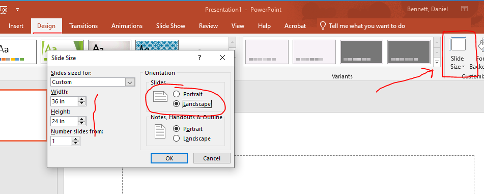
- The easiest thing is to design a poster in PowerPoint
- I would make the height 24"
- And probably 36" long.
-

- From Idaho
- Text should be 24-48 point font.
- Serif is better.
- Be careful with small images, they will look awful when printed.
- The Poster Rubric
 (From Wikipedia)

