Sales
When you finish this exercise you should
- Construct charts in excel.
For this exercise we have data from an import/export business. I grabbed this data from kaggle.com and there is no real description of where the raw data came from. I suspect it is artificial.
We would like to perform some basic visual analysis of this data. I have performed some basic data grouping for you and from this you will be drawing a number of charts.
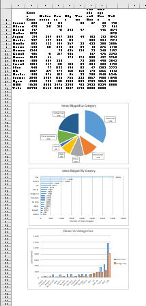
The first worksheet, labeled Units Shipped contains the number of units in each category that were shipped to each country. Be careful as this contains both a column and a row total.
The second worksheet Sales By Territory contains quarterly sales by territory. The territory names can be looked up on the Information worksheet.
The information worksheet contains basic source information as well as the worksheet that maps territories code to territory name.
Start with this document
Please place all charts on the same page as the data.
- Move the charts below the data, in order
-

Go to the Units Shipped worksheet.
Begin by producing a pie chart that demonstrates what items are sold the most.
- Use the labels for the items (B1:H1) and the total row (B21:H21)
- Construct a basic pie chart
- Title this Items Shipped by Category
- Make the Data Labels callouts showing both the category name and the percentage with a new line between them.
- Pull out the Classic Cars pie slice.
-

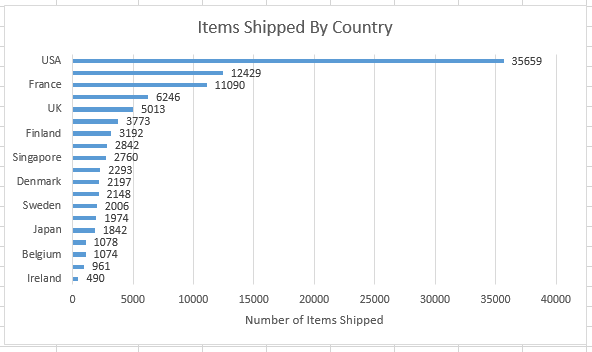
Create a column bar chart showing the total items shipped for each country.
- Select the country names and the total items shipped (columns A and I)
- Build a bar chart.
- Change the title to Items Shipped by Country
- Add a Horizontal Axis title Number of Items Shipped
- Add a data label to the outside end of each bar.
-

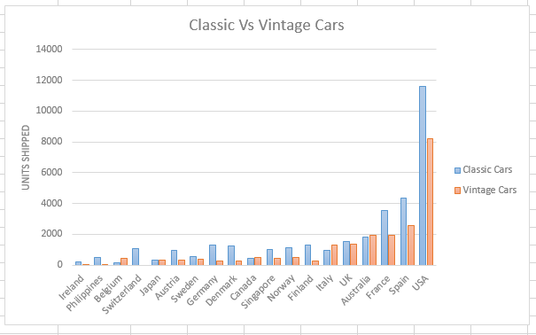
Finally create a clustered column chart to display car sales (classic and vintage) for all countries
- Make sure the vertical axis contains Units Shipped
- Use style 5 for this graph (hover over the Chart styles until style 5 is displayed.
- Move the Legend to the right.
-

Move to the Sales By Territory worksheet.
Add a new row in the worksheet
- This would be a new row 2.
- Automatically look up the territory names and fill in this row.
-

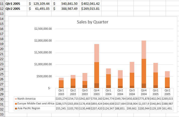
Insert a stacked column chart
- Containing all of the data in this table.
- Title Sales by Quarter
- Include a data table in this chart.
- Apply an monochrome color scheme to this chart.
-

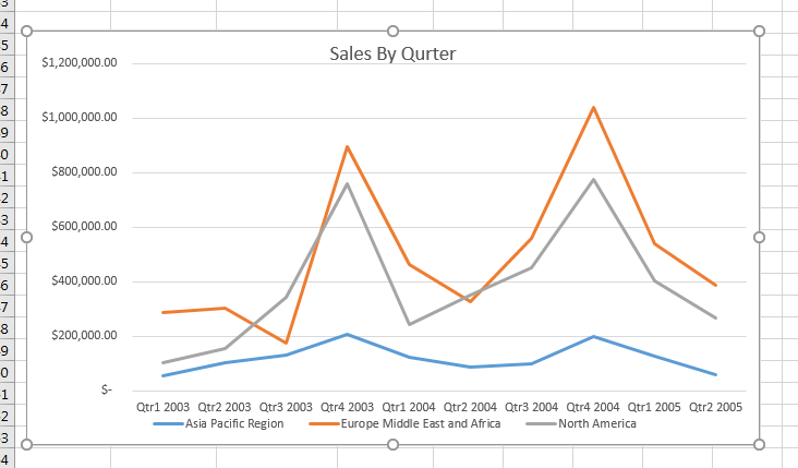
Finally, build a line graph to display all of the data.
- Get something close to this:
-

Save your document.
Submit your saved document to the Export Sales folder in the Assignment section of D2L for this class.
